


How Optimizing the User Flow for a CBD Brand Lifted CVR by 129% and Average Purchase Revenue per Active User by 83%
Category
Conversion Rate Optimization
Industry
Vitamins & Supplements
Project Overview
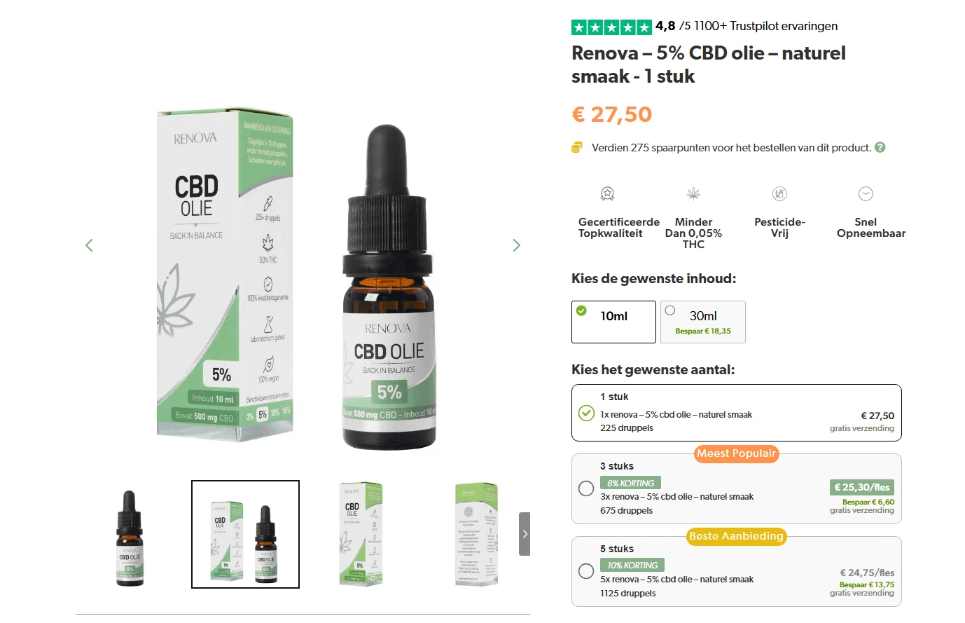
Clincher worked with a leading Dutch brand CBDOlie that makes high-quality CBD products and natural supplements.
Focus: help users solve their needs with products that are lab tested, use natural ingredients, are pure and sustainably sourced, and have 0.0% THC.
The Challenge
Store visitors had trouble moving through the site. The average user didn’t know which product could help their need or which category to check. The site flow was not helpful, so frustration and abandonment were high.
We focused on optimizing the user flow, especially because most users started on the homepage and collection pages. By finding and fixing the key issues, we lifted conversions and increased average purchase revenue per active user.
Identifying Key Issues on Homepage and Collections
Homepage
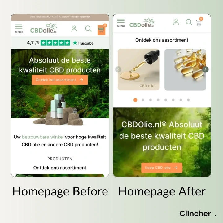
1. Missing Category Links in Hero Section
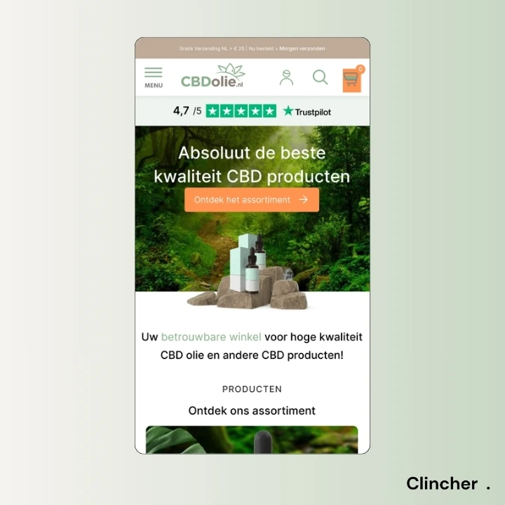
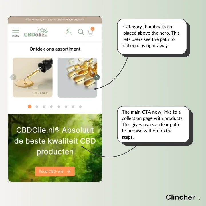
There were no category links in the hero section. This made it harder for users to see a clear path to categories within the first 5 seconds, especially because most customers land on the homepage.
2. No Bestsellers Section
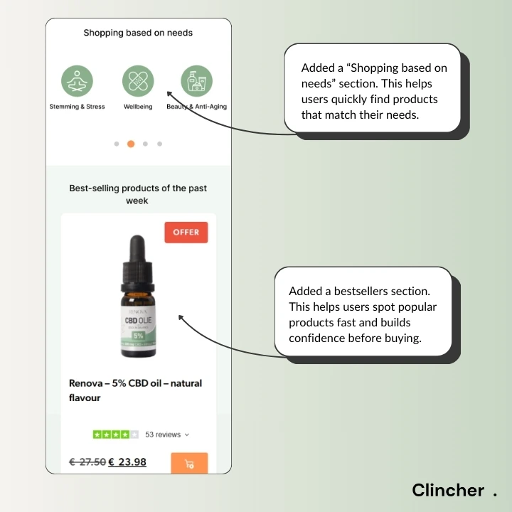
There was no section showing the most purchased products. This was a problem because users often look for popular items to guide their decisions. Without this, they missed top products or felt unsure about what to buy.
3. No Best Deals section
There was no best deals section. This is a problem because users often look for discounts and promotions. Without a clear section on the homepage, they missed out on deals.
4. Main CTA Redirects to Advice Tool, Not Products
The main CTA button redirected users to an advice tool. This was overwhelming for first-time users who just want to see the product range. It also discouraged them from exploring further.
5. No Thematic Product Browsing
There was no section for browsing products based on user needs. This made it harder for users to find products that match their goals.
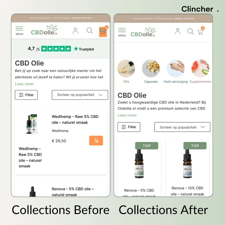
Collection page
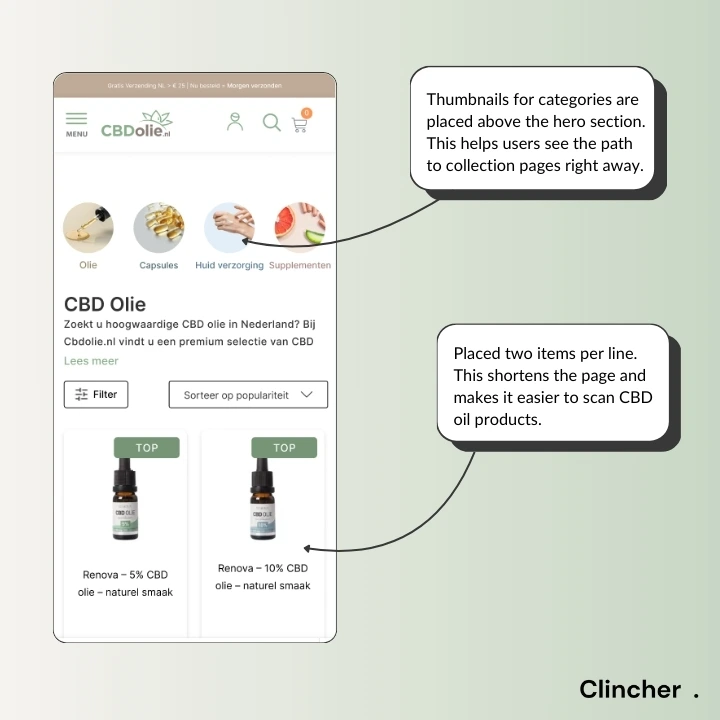
1. Missing Category Links in Hero Section
There were no category links in the hero section. This made it harder for users to see a clear path to categories within the first 5 seconds, especially because many customers land on a collection page and need to see the most important categories immediately.
2. No Highlighted Products
There wasn’t a clear highlight on the best products to buy. Users saw all products as equal, which made it harder to decide.
3. Single-Column Layout Makes Product Scanning Difficult
On mobile, every item was in one long column, making the collection page too long (especially with 30+ products). This overwhelmed users and made fast scanning hard.
Results
After 7 months of testing and implementing the changes, measurable improvements were visible in store performance:
129% increase in overall conversion rate
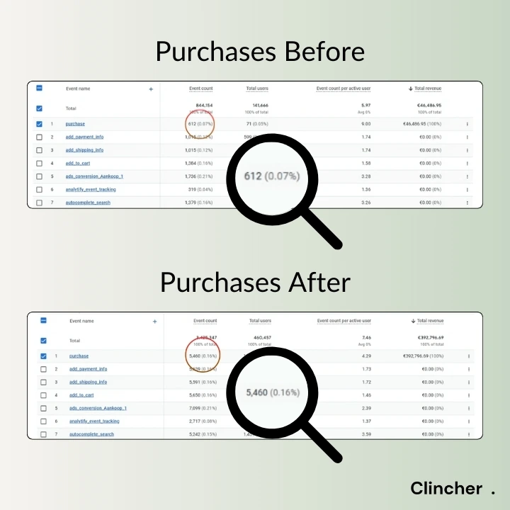
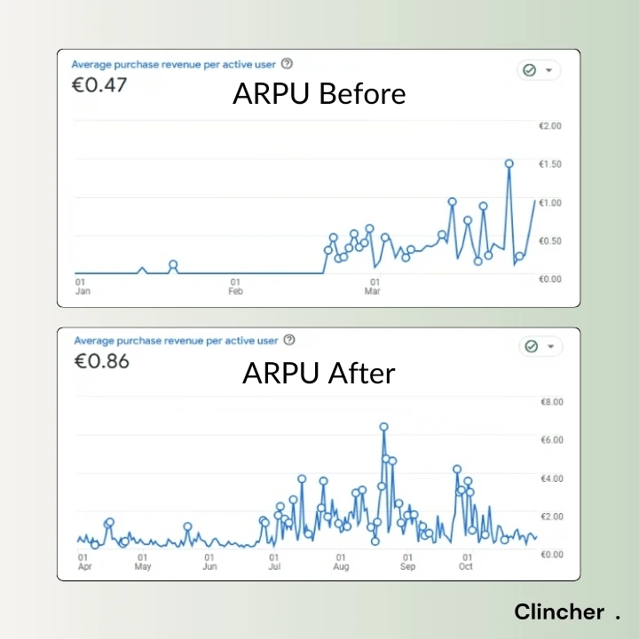
83% increase in Average Purchase Revenue Per Active User (ARPU)
By creating a smoother and more transparent shopping experience, more customers completed their purchases.
These results show how focused, data-backed changes can improve the customer journey, remove obstacles, and increase sales for online stores.
Access Product Page CRO Audit Example
Real industry example and a 65-page audit where we uncover crucial product page drop-offs, and provide data-backed conversion recommendations.

Grow Your Ecommerce Store With Clincher
Get in touch and we'll make sure to provide actionable insights for your store even before the call starts.
Let's talk
Let's talk


©2026 Clincher Studio LLC. All rights reserved.